Using media queries to improve accessibility
Sometimes you're faced with designs that are not optimal in terms of accessibility. The colors used in the design are lacking contrast or maybe some intense animation found its way into the project.
If all else fails
Of course, the first and most valuable thing to do is to discuss potential accessibility issues with your team. Maybe some elements can be refined and improved in the design or UX. If not, there are some tricks we can implement, to lessen the damage.
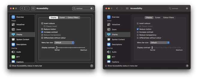
There are several OS settings that can be turned on to improve accessibility.
The good news is, we developers can utilize some of these in our code as well. There are some useful media queries that can assist us, such as prefers-reduced-motion and prefers-contrast.
1. Prefers reduced motion
prefers-reduced-motion
This media query can be used to detect if the user has requested less motion. This is especially valuable for users that experience motion sensitivities. With this you can disable animations altogether or offer a more subtle version.
.animation {
    animation: crazy-disco-vibes 1s infinite both;
}
@media (prefers-reduced-motion) {
    .animation {
        animation-name: fade-in;
    }
}
2. Prefers contrast
prefers-contrast
It was only recently that this feature has been implemented in Chrome 96. Browsers such as Firefox and Edge don’t offer support just yet, but we’re hoping and assuming this is just a matter of time.
With this media query we can respond to the “Increase contrast” OS setting and offer a more legible experience for different vision capabilities.
.button {
    background: orange;
    color: white;
}
@media (prefers-contrast: more) {
    .button {
        background: maroon;
    }
}
Voila, a button with better contrasting colors.
3. Prefers color scheme
prefers-color-scheme
Dark mode styles, when done right, can improve accessibility. Dark mode pages are less likely to trigger photophobia. They also make text on screens easier to read in low light conditions or for a long period of time.
When you’re mindful of sufficient contrast, adjusted focus styles (when needed), and images that work in both dark and light themes, they can help improving the overall accessibility.
A while ago we already touched on this topic, please visit our previous article if you want to find out more.
.article {
    background: lemonchiffon;
    color: black;
}
@media (prefers-color-scheme: dark) {
    .article {
        background: black;
        color: white;
    }
}
Emulating in devtools
You can test your media query specific code by toggling the right settings within the Accessibility menu of your operating system. However, this can be cumbersome. Luckily DevTools can help you emulating these settings:
- Open DevTools:
control+shift+i(Win/Lin) oroption+⌘+i(Mac) - Open the Command Control:
control+shift+P(Win/Lin) or⌘+shift+p(Mac) - Type “Show rendering”
- Set the Emulate CSS media feature
prefers-color-scheme(or one of the other available features) to the value you want to test
Media queries in JavaScript
There can be use-cases where you’d want to check these media queries within your JavaScript as well. You could create handy util functions using the matchMedia() method. For example:
export default function prefersReducedMotion() {
    return window.matchMedia("(prefers-reduced-motion: reduce)").matches;
}
Conclusion
Of course, the most ideal situation would be a design that works for everyone. Therefore, always explore possible solutions with your project team first. But, if all avenues are exhausted there are some media queries that might be able to improve the situation.
💡 Looking for more accessibility tips? Read our article to learn more.