CSS DAY — day 2
On Friday the 10th of June our front-end team attended CSS Day in Amsterdam. To hold on to the inspiring talks and techniques we wrote down our notes and some takeaways from this great second (and sadly, last) day:
.css-day {
    speakers: 7;
    date: "June 10";
    venue: Zuiderkerk; // Amsterdam, NL
    day: 2 of 2;
}
Oh Snap! That Scroll Control
— By Adam Argyle
Adam started the day off with a very cool and energetic talk about the never ending possibilities of scroll-snap.
He shared loads of examples and scenarios that are very useful in every day developer life.
Overflow - a review
The first step is always to create an overflow container. Adam discusses many overflow related properties.
.container {
    overflow-x: hidden;
    overflow-y: hidden;
    direction: rtl;
}
Fun fact: you can change the scroll direction, by choosing either rtl or ltr.
overflow-block
The overflow-block CSS property sets what shows when content overflows the block start and block end edges of a box. This may be nothing, a scroll bar, or the overflow content.
overflow-inline
The overflow-inline CSS property sets what shows when content overflows the inline start and end edges of a box. This may be nothing, a scroll bar, or the overflow content.
To understand scroll behavior there are several elements to keep in mind:
Root scroller
This is the top most scroller, the <html> element. Some elements can be scroll promoted: for instance a full screen overlay div can become the root scroller. The root scroller has some nice features, such as pull & refresh;
Implicit scrollers
These are all the other scrollable elements (that are not the root scroller).
Scroll port
The viewport frame of a scroller
Scroll behavior
This property lets you control if the browser scroll should be instant or animated. When the value is set to smooth, the scroll action will show a smooth animation.
It is good practice to turn this on when users have no preferred setting regarding the prefers-reduced-motion query.
Overscroll behavior
Controls if a nested scroller should trap its inertia or not.
Overscroll effect
UI feedback informing the user they are at the beginning or end of a scroll container.
Scroll hint
UI to help users see there’s room to scroll (cut content off). Sometimes in the form of shadows or gradients.
Scroll snap: the basics
// for the scrollport
scroll-snap-type: x proximaity // snap if it's close
scroll-snap-type: y mandatory; // this scroll always should find a snap point

// for scroll items
scroll-snap-align: start;
scroll-snap-align: center;
scroll-snap-align: end;
Good to know: Chrome devtools can show the snap points when enabled by clicking on the badge.
// basic horizontal scrolling
.snap-x {
    scroll-snap-tyoe: x mandatory;
}
.snap-x > * {
    scroll-snap-align: center;
}

// basic vertical scrolling
.snap-y {
    scroll-snap-tyoe: y mandatory;
}
.snap-x > * {
    scroll-snap-align: center;
}

// Matrix scrolling
.snap-both-axis {
    scroll-snap-type: both mandatory;
}
.snap-both-axis > * {
    scroll-snap-align: center;
}
Snap stop
Telling the browser a snap point is very important it will stop there. Be careful with this, as it may annoy users.
.snap-y > * {
    .scroll-snap-stop: always;
}
Scroll snap advanced
Single snap
Snap only that one single item:
.snap-x {
    scroll-snap-type: x mandatory;
}
.snap-x > :nth-child(5) {
    scroll-snap-align: center;
}
Indirect snap
Every nested node can be a destination.
.snap-x {
    scroll-snap-tyoe: x mandatory;
}
.snap-x > .some > .nested > .any-child {
    scroll-snap-align: center;
}
Scroll padding
When you scroll to an item, it’s nice to have some padding so it doesn’t stick to the scroll viewport edge. Keep in mind: this only works on the scroll viewport.
.scrollport-padding {
    --padding: 1rem;
    padding: var(--padding);
    scroll-padding: var(--padding); //match scroll padding with regular padding
}
Scroll margin
This is the same as scroll-padding but is used for spacing between the scroll items. Keep in mind: only works on scroll items!
.scroll-item-margin {
    scroll-margin: 1rem;
}
Scroll into view
Neat JS function that scrolls an element into view:
Element.scrollIntoView({
    behaviour: "smooth",
    inline: "center",
});
Snap after layout
Critical feature that takes care of resizing. As we resize the snap point is maintained. Handy if window is resized or device is rotated.
Intersection Observer
You can observe items with the Intersection Observer. You can discover which item is currently in view. And do certain things when this particular scroll item is in view.
Snap gallery
You can find several cool examples in Adam’s snap-gallery.netlify.app; Some highlights:
Scroll item with position sticky gives a cool effect:
.scroll-item {
    position: sticky;
    top: 0;
}
This gives a curtain-like slide effect.
Add 3d perspective
Parallax effect to scroll items:
.scrollport {
    perspective: 10px;
    perspective-origin: center center;
}
.scrollport,
scroll-item {
    transform-style: preserve-3d;
}
.scroll-item > p {
    transform: translateZ(-5px);
}
Tap to snap
Can be used to set an item in view by tapping it.
.scroll-port {
    overflow-x: auto;
    scroll-snap-type: x mandatory;
}
.scroll-item:is(:active, :focus) {
    scroll-snap-align: center;
}
Infinite scroll
To create an infinite scroll effect you can do that with the IntersectionObserver: when the end is reached, go back to the beginning. If the last item is into view, it will snap back to the first item.
// on scrollend
// ingcreage gap to 100vw
// el in view is anpped
// remove huge gap
Overscroll Effect
The overscroll effect is the bouncy gesture you may know from iOS. In Chrome there is a similar effect, but currently it only bounces the root scroller (<html> element). Chrome is planning on making this work on all scroll elements in the future.
Pull to refresh
To create a “pull to refresh” effect, these are the steps you could take:
// Tiny snap point at top of refresh el
// Delayed snap point on tiny el
// Scrollend checks scrollTop to be0
// Set loading attr
// Wait for fetch()
// scrollIntoView()
// ScrollTimeline for flare
// snap-stop always on main for UX
Use case: chat bubble
In chat interfaces you usually want the last chat bubble to snap to the end of the container (or bottom if you will). To stay snapped to the bottom you can use this:
.chat-bubble:last-child {
    scroll-snap-align: end;
}
Adam has many many more useful examples, have a look at his slides;
Coming next in Scroll nap
:snapped {
    outline: 10px solid red;
}

.snapped-x {
    outline: 1px solid hotpink;
}
scroll-start-target-inlineandscroll-start
snapChanging()
snapTo()
.scrollport.scrooolTO({
    left: 'snap-prev',
    behavior: 'smooth'
})
Creative CSS Layout & THe Flexible Web
— By Michelle Barker
Michelle works at Ada Mode (a data science AI company in the renewable energy sector). Michelle considers herself a CSS Tinkerer. She states that this is an exciting time for CSS, as new features are being added at a blazing pace. The web is fluid and not fixed, we have more tools than ever before: diversity is strength and not limited by it.
CSS Layout in 2022 and beyond
Before flexbox there were no real layout methods for the web. Since then a lot of new layout methods have emerged, such as multi-column, grid, custom properties, viewport units etc. Coming up are container queries, :has() (parent selector) and subgrid.
What these features have in common is that they all build flexible layouts. This falls into intrinsic web design: to use the web in its own right, without being some sort of print-version.
Flexbox or grid?
The answer is usually: either or both. Grid replaces flexbox in some situations. They’re both valid tools, with overlapping use cases. Grid is very much suited for two-dimensional layouts, flexbox for layouts on a single dimension. Michelle shows some examples where either flexbox or grid is more suited.
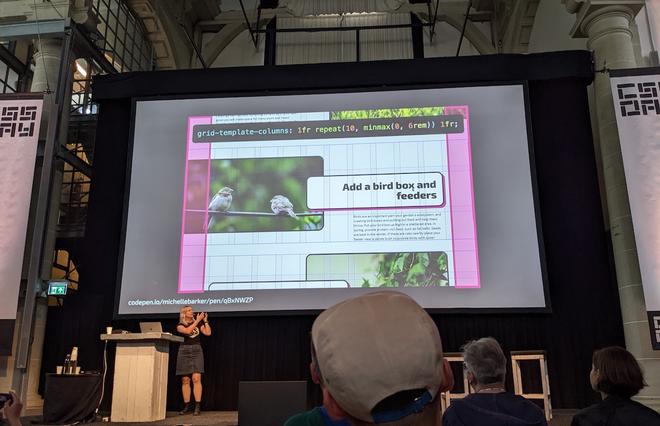
Michelle shows a great example of a layout typically suited for grid layout.
Gap
Gaps are now also supported when using flexbox:
.flex-container {
    gap: 3em;
}
We can use smart values to create responsive/fluid gaps:
    .container {
        gap: min(1rem, 2vw)
        gap: clamp(1rem, 2vw, 3rem)
    }
Have a look at utopia.fyi for a fluid space calculator.
aspect-ratio & object-fit
With a single line of CSS you can create boxes with an aspect ratio, without having to use the older, hacky methods.
bject-fit is a very powerful tool to main the proportions of an image.
aspect-ratio values can act as a minimum. Images can grow along when the parent is a stretchable flex-container.
aspect-ratio can also be set on a grid container.
Auto fit & auto fill
grid-template-columns: repeat(auto-fit, minmax(19rem, 1fr));
Note that the items will overflow if the window is smaller than 19rem.
grid-template-columns: auto-fit, minmax(min(19rem, 100%), 1fr);
auto-fill will fill up the container, auto-fit will span the items just using their width.
Quantity queries
With quantity queries you can control the layout in even more detail:
.item;
last-child:nth-child(3n + 2) {
    grid-column: 4 / span 2;
}
.item;
nth-last-child(3):nth-child(3n + 21) {
    grid-column: 2 / span 2;
}
If we could query the width of the parent element;
main,
aside {
    container: inline-size / layout;
}
.grid {
    display: grid;
}
@container layout (inline-size > 25em) {
    .grid {
        grid-template-columns: repeat(2, 1fr);
    }
}
@container layout (inline-size > 65em) {
    .grid {
        grid-template-columns: repeat(4, 1fr);
    }
}
Container relative units
Container units can be very useful to create flexible sizing:
-cqw query container width -cqh query container height -cqi query container inline size -qpb query container block size -cqmin smallest of cqi or cqb -cqmax largest of cqi or cqb
font-size: clamp(1rem, 5cqi + 1rem, 3rem);
Subgrid
Allows grid children to inherit their parent grid. This can be very useful for cards that have content that should align with content from other cards:
.card {
    grid-row: span 3;
    display: grid;
    gap: 0;
    grid-template-rows: subgrid;
}
:has() (the parent selector pseudo-class)
Michelle is also excited about the :has() pseudo-class.
// if the grid has an image
.grid:has(img) img {
    // do stuff
}
// if grid has even numbers
.grid:has(:last-child:nth-child(even)) {
    --cols: 2;
}
Getting Creative with Keyframes
— By Amit Sheen
Amit has a deep passion for animation. He shows us how he goes about making an animation. He uses @keyframes are as the heart and soul of his animations.
Breakdown of an animation
animation: cubeHeight 3s infinite ease-in-out;

@keyframes cubeHeight {
    0% {
        height: 0;
    }
    ??? / 75% {
        height: 100px;
    }
    100% {
        height: 0;
    }
}
Amit shows the animation on a graph to break down the separate keyframe steps. The animation-graph is the transition between the points in the keyframes animation in combination with the timing functions. Amit usually first draws the graph (on paper) and translates this into keyframe steps, this really helps with understanding and creating complex animations with multiple steps.
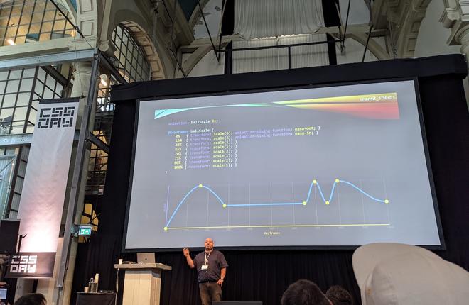
Our main takeaway: a proper planning is key.
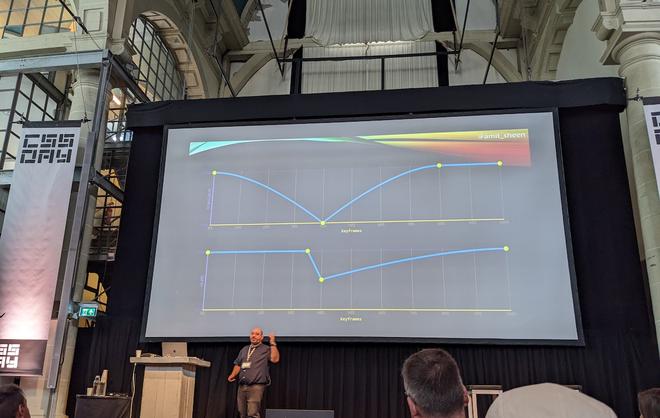
Synchronising animations of multiple elements
In the case of two colliding elements (like a ball hitting a cube) when working on an animation it can be very insightful to plot them on the graph and mark the control points. And translate them into keyframes:
Don’t be negative
When using delays within an animation don’t use negative values …unless you need to. Cases where this is useful when you want to animate elements that have a good starting point. You can set a start position with negative translate value, but you can also adjust the delay by subtracting the entire animation duration:
// 6 items: 150 x 6 = 900
--delay: 150ms * i - 900ms;
Performance
Performance is also important. The main rule when using animations: don’t trigger reflow. So use transforms instead of width, height etc, if you can. Sometimes there’s no way around it, that’s where custom properties can be of use.
Amit’s talk was really insightful to learn a good approach when creating animations. So: start with a clear description, draw a simple graph and use a negative delay (where needed), stay performant and accessible (respect the user preference)! When you add a slight random() to the delays of an animation, they will feel more real.
Have a look at his Codepen for very impressive keyframe animations.
The Joy of CSS
— By Ben Evans
Ben Evans, a pure CSS Artist gave the audience a very pleasant “time to relax” in the spirit of Bob Ross. Ben creates art with CSS, divs and yes: no images.
“Lets get back to basics and just move some divs around for a while.” Ben Evans
One of the advantages of making pure CSS art is that you use all of CSS’s capabilities: “You can’t master something without knowing its limits”.
Ben showed us how he creates this art in the browser.
Screenshot of a beautiful example of his work.
We strongly recommend to check out his mind blowing collection of art on his CodePen.
Service Design and Front End Interaction
— By Maike Klip
Maike is a designer/UX researcher and works for the Dutch government. She talks about her work on digital services like DUO, the integration law and she helped develop the CoronaMelder app.
Design research project
Maike has done intensive research on the relationship citizens have with the government. She was set on answering the question how the government(computer-like) can have a compassionate connection with citizens (humans). Nowadays, citizens almost never have real contact with the government anymore.
“The government has become a machine” Reinier van Zutphen, Nationale Ombudsman
The dark patterns of government
Maike found it frustrating to know things should be done better, but it’s hard to create change. She Worked together with Janet Ramesar (victim “Toeslagenaffaire”) to learn from the mistakes that have been made.
Maike mapped all her interactions with the government for an entire month, in this Miro board. She identified the systems that where involved and what teams are behind those systems.She quickly found that everything is really complex and entangled.
The key values that should be translated into these laws and regulations: desirable, viable, responsible, technological.
Groningen
Maike showed us a data visualisation of the earthquakes in Groningen. Those earthquake damages are big and people need to be given safety and future perspective. What should a governmental operation like this look like?
The subsidies weren’t enough and people waited in long queues ooff- and online. The user experience of the website used to request this subsidy was considered really bad and fragile. If the product was developed with the users and the key principles in mind, a lot of issues could have been prevented.
Designers and developers are the gatekeepers (and should take this responsibility seriously), you’re making the connection with the user.
“When you work in design/tech you work in politics.” By Maike Klip
The Future of Organizing Your CSS
— By Tab Atkins-Bittner
It’s time for Tab to take the stage again. Tab states that Pages used to be simple, but today they’re more complex. Back in the day we had simple selectors:
- a:visited, button, .foo
- .sidebar button, button.selected
- #top#top.product-page .sidebar .button__selected
- color: red !important;
Now the selectors are getting more complex and specificity issues arise. Possible solutions are methodologies like OOCS, atomic CSS, complicated design systems or just give up altogether and just use a framework (like Bootstrap). But Tab says we can do better.
Shadow DOM
A big issue is that documents keep getting larger, and CSS is getting larger. The performance of your page is negatively impacted by this. CSS performance is, roughly, DOM size * selector count. Shadow DOM is about slicing up that big document into tiny ones.
Setting up customElements
customElements.define('dice-roll',
  class extends HTMLElement {
    constructor() {
      super();
      let template = document.querySelector('#dice-roll');

      const sr = this.attachShadow({mode: 'open'});
      sr.appendChild(template.content.cloneNode(true));

      sr.querySelector("button").addEventListener('click', ()=>{
      	...
	  });
    }
  }
);
<template id="dice-roll">
    <button>
        <slot>(Error: supply a dice roll.)</slot>
        <span hidden>
            =
            <output></output>
        </span>
    </button>
</template>

<p>The attack deals <dice-roll>2d8+2</dice-roll> damage.</p>
The interesting thing about styles within the shadow DOM is: they’re isolated. Styling won’t accidentally affect other elements.
How to style shadow DOM
Nested <style> is also fast and efficient.
<template id="dice-roll">
    ...snipped example...
    <style>
        button {
            font-size: inherit;
        }
    </style>
</template>
If there are many of these styled buttons, the style will be automatically shared / reused by the browser. As long as they’re not individually modified.
new CSSStyleSheet(...) is a new feature and lets you ship your CSS in your JS, and only parses the CSS once.
import sheet from './style.css' assert {type:'css'} works too! More info about module scripts
Encapsulation is a double edged sword
Inside vs. outside styling: CSS Variables can be used within the <template> and can be then used to adjust the styling from the outside in.
::part()
::part() is a solution to add extensive styling in a good way. More info about shadow parts.
Set up some elements as “parts”, these will be visible outside of the component. These parts can then be targeted with ::part().
Note: ::part() hides implementation details, these are not exposed. But exportparts="name" unhides implementations.
Scoping styles
Another technique Tab talks about is scoping.
“Do not exceed the donut”, create bounds to limit certain styling to:
@scope (.media-object) to (.content) {
	img {...}
	video {...}
}
Selecting relative to the root:
@scope (.media-object) to (.sidebar :scope .content) {
	img {...}
	video {...}
}
Nesting
Nesting in CSS nowadays doesn’t really work, because of the cascade (the order of styles can get in the way).
@scope nesting does work:
@scope (.light) {
    :scope {
        background: white;
    }
    a {
        color: blue;
    }
}
@scope (.dark) {
    :scope {
        background: black;
    }
    a {
        color: lime;
    }
}
CSS Nesting
Currently in development is CSS nesting. This nesting is almost as good as Sass: https://drafts.csswg.org/css-nesting/.
It actually works the same as it does in Sass:
.light {
    background: white;
    & a {
        color: blue;
    }
}
Or do this with @nest, because CSS parsing is complex and this makes it more explicit for the parser:
.light {
    background: white;
    @nest & a {
        color: blue;
    }
}
This was a very interesting talk about how we can expand our toolbox and use techniques that are more efficient. You can check out the slides here.
When Design Systems Lie
— By Stephen Hay
Stephen Hay concludes thi last CSS day with a talk about design systems. Stephen tells us about design systems and how they sometimes lie or don’t really work.
“Do design systems cause good design” is a question Stephen wants answered.
Design Decisions are part of the system. And Design Reality is sometimes something different. Every system is contained in another system. In larger organizations we tend to work in silos. Stephen says to zoom out to measure the effects of the things you do. Design systems inform design decisions, or do they really? Reality should inform design sytemns, and design decisions should inform reality. And this is not always happening.
Lie 1: Most design systems aren’t glorified component libraries.
But they often are, and that is not necessarily a problem. If it’s just about the components, don’t call it a design system. Components on their own are not enough. A collection of components is not necessarily a sytem, but a collection. We need more information about how they interact with each other within an environment.
Truth: Seek understanding about the environment(s) containing your system.
Lie 2: Documentation is optional
“No one reads documentation”. But documentation can take many forms. Walls of text are not really helpful, but examples can be. Documentation should be the main focus when developing a design system.
Truth: Discover the best ways to communicate how to use the parts of your system and how they work together.
Lie 3: Design systems should strive to be complete
Don’t worry about it, they don’t need to be. The simplest systems are the ones that adapt best over time.
Truth: Refactoring is alo part of the work, thus part of the system. Keep it simple.
Lie 4: Atomic design is a linear process
Atomic design is rather a mental model to help us think of our user interfaces as both a cohesive whole and collection of parts at the same time. You don’t have to follow this method from head to start: figure out what works.
Truth: The basic building blocks of a visual identity are the most important. Allow for discovery using those and introduce patterns back into the system.
Lie 4.1: Design systems should predict the future
Systems fail when you ignore the context. You are ignoring the context if you try to predict the future. If you don’t design for change, the cost of change will keep us from changing things in the future. You don’t want the system to dictate your decisions.
Truth: You’re bad at predicting the future, don’t try this with your design system.
Lie 5: Having choices replaces thought.
Back in the day designers were seen as artsy farty freewheelers, in reaction to this systems were introduced. Stephen shows as example of a table with a set of options per category. We should limit the choices because in the end: they limit creativity.
Truth: The system is just a tool. It doesn’t do the heavy lifing. Treat it as such.
Lie 6: Design systems are as important as we make them out to be
We want more beauty. We like things to be beautiful: create beautiful design systems. If you say aesthetics are irrelevant and seperate that from the product, it will be bad for the product in the end.
Truth: Aesthetics are part of function and form the purpose of the system(form follows function). The system codified agreements about aesthetics but this is secondary to them.
"Design is not making beauty; beauty emerges from selection, affinities, integration, love" Louis Khan
And these were our notes of the final day. We really enjoyed this conference and were amazed and energised by all these great talks. They were a great inspiration and we’re looking forward to next year.