A Sass snippet for handling same-color block margins
At GRRR we've been building most of our websites in a way that enables users to create pages with a predefined set of so-called blocks. However, combining these blocks can lead to unexpected visual results.
Most content blocks have some type of inner margin, usually in the form of padding on the container or margins on inner children. This is mostly due to aesthetics, since content needs some air to breathe a bit. It allows the different types of content to be distinguishable, and therefore the page to be scannable and readable.
Having two blocks with different background colors will not pose a problem; the margins are visually equal and evenly distributed:
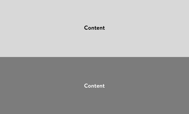
Two blocks with different background colors.
When two blocks with the same color are combined however, it will result in visually doubled negative space (or white space):
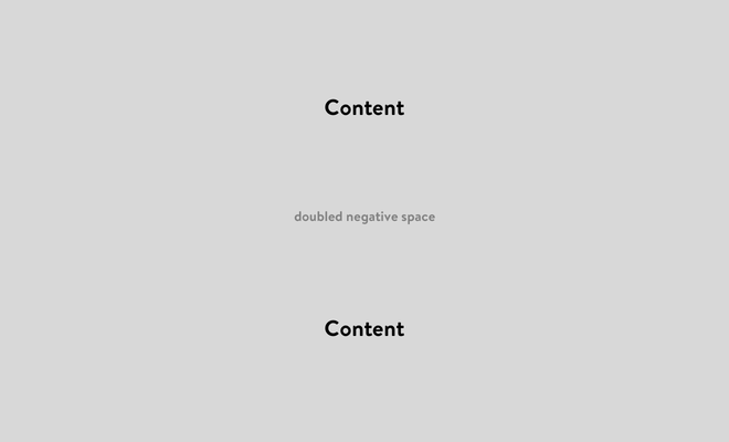
Two blocks with the same background colors, resulting in extra negative space.
Our solution
In early projects we’ve added layout controls, allowing the user to select top and bottom margins for each individual block. In more recents projects, we’ve shifted this responsibility back to the front-end developer, since in most cases there should be only one ‘perfect’ distance between specific blocks.
Since we really like to scope our Sass modules, as specified in our coding standards, we usually allow only a single BEM block to be present inside a Sass module. Therefore we’ve introduced a Sass file called block-combinations.scss, to not pollute our block Sass modules with other module classes.
In this file we define certain blocks and have a Sass snippet that loops over all possible combinations and removes the top margin/padding to fix the doubled negative space. Think of it as a utility file which only responsibility it is to handle combinations of blocks and how they respond to each other.
Snippet
Here’s an example of how a simple implementation would look like:
$white-blocks: (
    "audio-block",
    "faq-block",
    "image-block",
    "text-block",
    "text-image-block",
    "video-block"
);

@each $previous-block in $white-blocks {
    @each $next-block in $white-blocks {
        .#{$previous-block} + .#{$next-block} {
            padding-top: 0;
        }
    }
}
In this case it loops over all the white blocks, but it can be expanded with other ‘colors’ or use cases. Specific combination can always be overwritten below in the file, due to the CSS cascade:
[...] .audio-block + .image-block {
    padding-top: calc(2vw + 1rem);
}
Extending it
You could extend it and create a key/value Sass map, loop over the combinations and adjust the margins per block:
$white-blocks: (
    "audio-block": 0,
    "faq-block": 0,
    "image-block": calc(2vw + 1rem),
    "text-block": calc(4vw + 2rem),
    "text-image-block": 0,
    "video-block": 0,
);

@each $previous-block, $previous-margin in $white-blocks {
    @each $next-block, $next-margin in $white-blocks {
        .#{$previous-block} + .#{$next-block} {
            padding-top: $next-margin;
        }
    }
}
You could also add nested margins per breakpoint, but we like our margins to be fluid, based on screen width. This is the case in the above example; the rem is used as a minimum margin.
In the end there are a lot of solutions and possibilities. This is a solution that has been working for us, and implementation will always differ per project and architecture.