Coding for accessibility: an introduction
At GRRR we really aim to be accessible and inclusive: it matters to us that anyone can visit and use our websites. It's no longer only mandatory for municipalities and other governmental bodies to ensure their websites are accessible. Since the Equal Treatment Act came into effect, all websites should be as accessible as they reasonably can be.
Worldwide roughly 15% of the people have some form of a significant disability1. While often the focus lies on people with a visual impairment, there are several other conditions that are even more prevalent. Think about auditory & physical impairments, low literacy and dyslexia, for example. Luckily, small changes in the way we work can make a website more accessible.
“The power of the Web is in its universality. Access by everyone regardless of disability is an essential aspect.”
Accessibility guidelines
Where to start? Thankfully, there is WCAG 2.0 to the rescue. WCAG stands for Web Content Accessibility Guidelines, and offers elaborate guidelines subdivided into three different levels. At GRRR we always want to meet the requirements of at least level A.
Web accessibility isn’t something that should be solely the developer’s responsibility. Many affecting decisions also lie in the domain of design, interaction and content strategy. It will pay off to incorporate accessibility into a project right from the early stages.
Quick wins
Even if it’s not all in your hands, there is a lot you can do as a developer. And to contrary belief, it doesn’t always takes more time to build the accessible way. Small changes in the way you work can go a long way:
A good start is half the battle
Set up your document the right way
Start with applying the right doctype to your page. This is helping the browser and assistive technology to interpret the page the correct way.
Often overlooked, but don’t forget to specify the right language in the lang attribute on the html element. This way a screen reader knows which voice profile to pick when reading the content.
<!DOCTYPE html>
<!-- Tell the browser to serve a HTML5 document -->
<html lang="en">
    <!-- This document's language is set to English -->
</html>
As you might know, the viewport meta tag goes in the <head> of your page to let web developers control the viewport’s size and scale. In order to allow users to zoom the page, never disable user scaling with user-scalable=no.
Inaccessible:
<meta
    name="viewport"
    content="width=device-width, initial-scale=1,
    minimum-scale=1, maximum-scale=1, user-scalable=no"
/>
Accessible:
<meta name="viewport" content="width=device-width, initial-scale=1" />
HTML5
Always use the right HTML elements for your page. Keep in mind that a div or span have no semantic value whatsoever. In order for assistive technology to understand what certain sections actually mean, there’s a wide array of elements to choose from.
💡 http://html5doctor.com/element-index/
Root fontsize
Never define an absolute font-size on the root element, html. It removes the visitor’s ability to adjust the font size in their browser settings.
Inaccessible:
html {
    font-size: 16px;
}
Accessible:
html {
    font-size: 100%;
}
html {
    font-size: 1em;
}
Forms
Labels
When creating forms use labels (a placeholder is not a label) and make sure there is a relation with the corresponding input. Do this by either explicitly binding the label to the input with a for attribute or by wrapping the input with the matching label.
Autofocus
Don’t use the autofocus attribute, it can cause disorientation.
Errors & color
Don’t rely on the use of color alone to show there’s an error. Always offer more information, so that people with color blindness don’t miss out on any crucial feedback.
Inaccessible:

By just using color to communicate there's an error, people who have trouble distinguishing certain colors might not be able to notice it.
Accessible:

By giving more information, such as a nice error description and maybe even adding an icon, this message is clear for those who experience color blindness
Headings
Assistive technology, like screen readers, use headings to make sense out of a page. More than half of all screen reader users rely on these headers to navigate through a page2. Therefore all headings should be used hierarchically and should never skip a level.
Working with images
When an image is portraying information always place a description of what’s happening in the image, in its alt attribute.
When the image merely serves a decorative purpose, or if the visual information is already described in de surrounding content, you can definitely leave it empty.
img src="happy-cat.jpg" alt=""
Never remove the alt attribute as some screen readers will read the entire filename out loud. This can get quite annoying if the filename is not human-readable:
2016-08-2916-4704-1680x1116.jpg
💡More on how to write great alt texts: https://webaim.org/techniques/alttext/
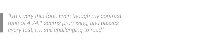
Contrast ratio
To make sure everyone can read the text on your website, keep the advised contrast ratio in mind. While often this is already taken care off in the design process, sometimes it will end up being your call to decide what color certain elements will be.
To ensure that a contrast ratio of 4.5:1 (regular text) or 3:1 (large text) is met, you can use a variety of tools (like contrast-ratio.com or the contrast analyzer from The Paciello Group).
Keep in mind that these rules aren’t always beatific. Use common sense. When you’re working with a very thin font, a ratio of 4.5:1 isn’t always enough.
Keyboard
Not all visitors can or like to use a mouse. Make sure all content is reachable or operable by using a keyboard and that there’s no keyboard trap.
💡Overview of focusable elements: https://allyjs.io/data-tables/focusable.html
Focus styles
Whenever an element receives focus there is some visual feedback, often in the form of a glowy blue outline, or dotted borders. Not everyone is too keen on these standard browser styles, and it’s often I get a request to remove “these ugly blue shadows”.
Big, blue & beautiful
However, this is important visual feedback and should never be removed. When disabling these styles, always offer new, alternative styling.
Conclusion
As you can see there are many things you can do to improve the accessibility of your website without going to great lengths of work.
Next time: More on the new WCAG 2.1